
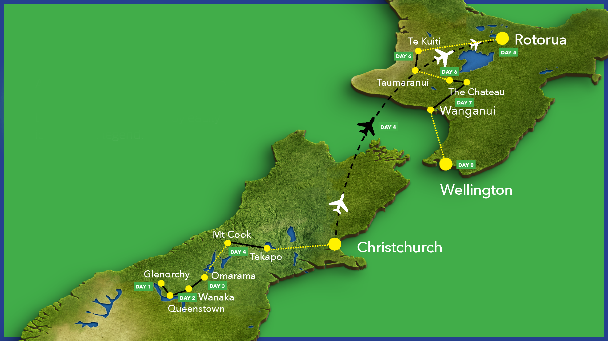
The Tour of New Zealand is an epic week of riding on roads not included in any other event. Whether you want to work together with your friends at a relaxed pace or lap it out in the gutter with the goal of being the top team, this race has it all.
My role
To re-think deployment of rider-safety practices, communication and interaction between over 400 riders on the Tour of New Zealand.
Services
Workshop and Design Sprint Facilitation, Product Research,
UX/UI Design and Strategy
Achievement
Significant reduction in print-led communication pieces. The app is targeted to better communication between the riders and the hosts, promote local businesses on the tour and above all, increase safety for all riders on the tour.

Background
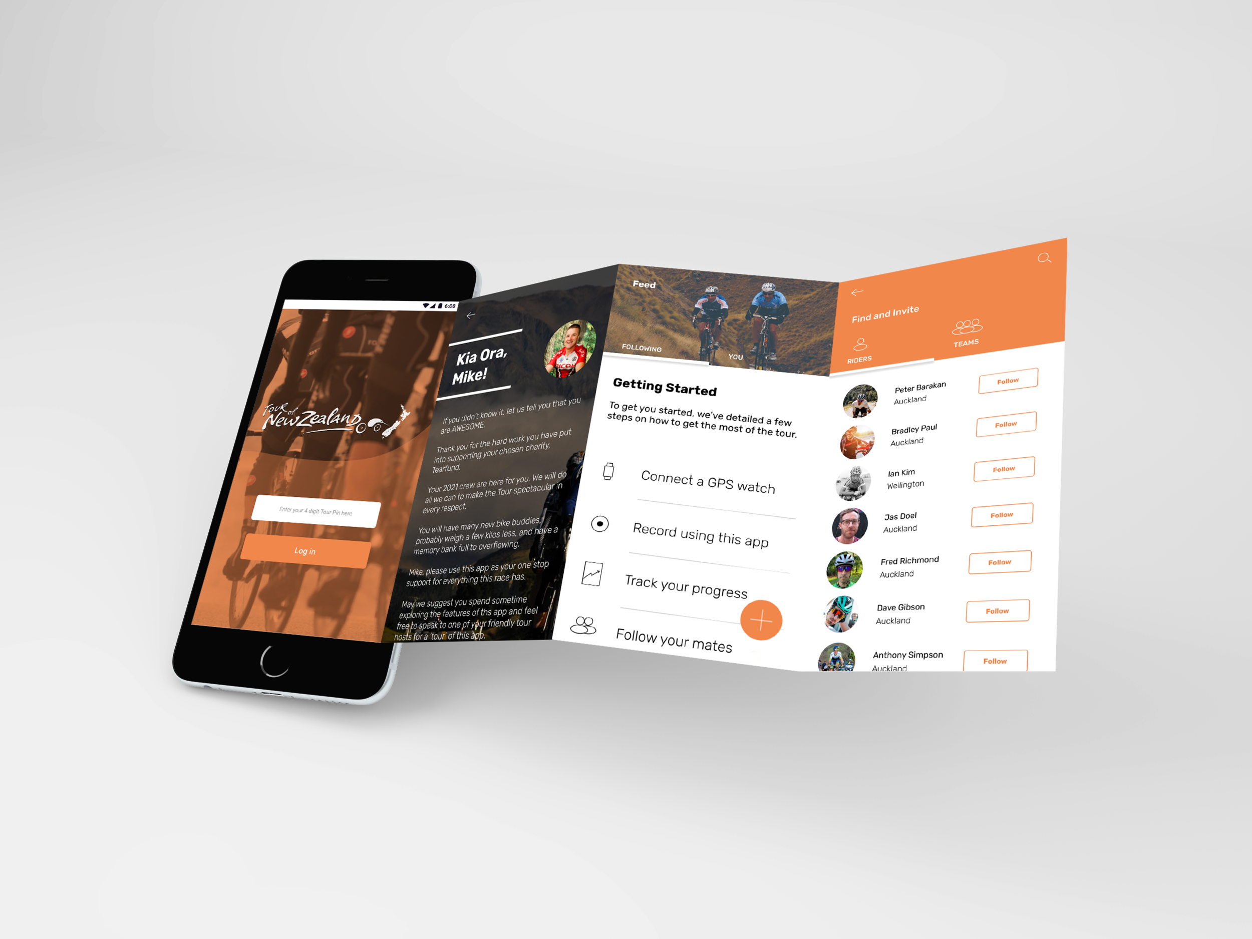
When I first worked on the Tour of New Zealand as the only designer in late 2015, I created the service blue print, mapped the customer journey, designed print and digital marketing pieces and facilitated receiving of entries through a new website and organised newsletters and landing pages.
The tour has historically relied on a printed handbook that was given out to the riders at the time of the race. This handbook had listed the day stages of the tour, safety practices and emergency numbers. The riders were expected to retain the book for the duration of the race.
Although the riders were encourages to use Strava, a current market leader for the purpose for the duration of the race to record the activity, there was little personalisation in the product.
But it didn’t take long before the tour director, Peter Yarrell realised the need for a solution that could replace Strava and the handbook while creating a community before, during and after the race.
The scope of the product had then changed from 7 days of the tour to, from the date of sign up of the next race to the date of sign up of the race thereafter. The opportunity was big and scalable.
Process
I knew it wasn’t just about picking the low hanging fruit but there was need to optimise this opportunity while there was a serious appetite and budget for solutionising.
We had a team of researcher, UX, UI and 4 SMEs (who had been regular riders and patrons of the race). These included the principal at Bell Gully Lawyers, Mike Pollok - MD Ricoh New Zealand, and senior employees from Downer and Vero.
Given time was of essence, I set out to do a thorough ‘competitive analysis’ of Strava. We decided to retain the key features the SME focus group revealed and repurpose the skimmed content from the handbook to serve as a total replacement.

KEY FINDINGS
We quickly learnt a few things from the focus group:.
Users didn't like long numbers with many decimals.
Users didn’t read the text in the handbook.
They rather make the call to the hosts when required learn feed the number in their phone to make a call.
Knowing how their mates were doing was important to add to a competition for a playful banter later at the pub.
Almost all the riders used a smart watch to track their activities.
Users generally didn't want any additional complexity added to the riding experience.
Our task was to create a solution that would give users more freedom and communication when on the go, whilst not disturbing their existing experience. Based on the findings from our user research we came up with a few different ideas.
With basic paper / low-fi prototypes we tested the different options to narrow down the field of ideas. The solution we decided on was to simply to show the user the simple tasks they can complete in the least number of clicks possible.
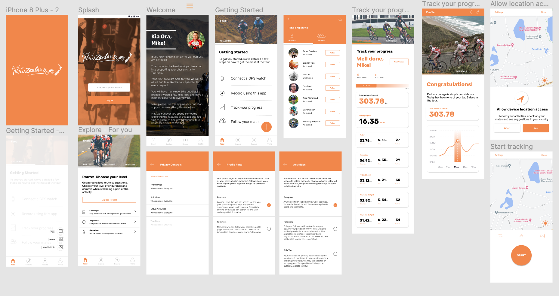
We knew that the system-generated 4 digit PIN and the email (submitted at the time of enrolment) was sufficient to pre-populate their profiles with their credentials and the name of their chosen charity.

We replicated the parts of the product we wanted SME validation on a whiteboard and allowed the team to vote silently.
I observed the heatmaps and made notes that came in handy for the prototyping stage 2, Wireframing.
The purpose of this exercise was only to track and manoeuvre the direction of the team output.
There was strong positive reaction to the content of the app.
The wireframes and flows were tested. Our quick learnings were:
Our understanding of the primary purpose for the app were correct.
Users didn't care to complete their complete profiles and bio - some were reluctant to link their account with Facebook. Privacy features had to be toggle-able.
All users tested loved the quick snapshot of their activity and wanted to know their position in the race at the end of every day-stage.
User’s didn’t see value in being able to compare individual stats of their activity with others.
Some riders were solo teams and others were in multiple-rider teams. With this understanding, we now had to be mindful of allowing riders to follow individual riders within the teams as against only teams.
“This app will change the race forever—in a good way”
Peter Yarrell - Race Director
Now we knew we had a winning formula but we also saw a challenge in perfecting the design. Not only did it need to be a functional solution, but using the function also needed to be an engaging and exciting experience.

Privacy
We added no unnecessary complexity for users to use the app in constrained environments.
Users tested and loved the quick snapshot of their activity and were able to know their position in the race at the end of every day-stage.
Research and focus group with SME had previously revealed the need for upfront privacy settings which were addressed.
We also designed a test zone for new and inexperienced app-users to use the app in a test environment before the race commences to increase product cognition.
Given the diverse age of the users, inclusive design practices were observed in the UI. We stayed away from Neumorphic design and allowed for better usability through Material Design principles.

Make it stand out.
I am truly grateful that I was able to be a part of this project.
The tour is a great medium that directly connects businesses with their charities, while providing their employees a taste of our beautiful country.