From affiliate links to a Marketplace experience MVP
The Challange
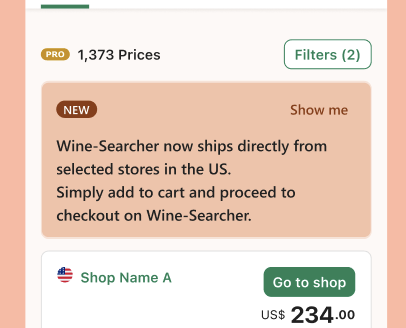
Go to Shop ->
Add to Cart
Wine-Searcher is a web search engine enabling users to locate the price and availability of a given wine, whiskey, spirit or beer globally, and be directed to a business selling the alcoholic beverage.
In my role as contract design lead at Wine-Searcher, I made a deep dive to understand the business needs to expand and implement the existing UX Research practices.
Wine-Searcher was acquired by Flaviar, a US based scale up excelling in specialised, high-end spirits e-comm.
My contract was then extended to map and design-deliver the end-to-end marketplace experience for Wine-Searcher users.
My previous experience of working in fast releases with an understanding of MVP and fast followers was valued by the team in a VUCA environment with tight deadlines.
The journey and the BHAG
From experience, nothing brings a team together like a well run journey mapping workshop. Really low fidelity provides the team with the opportunity to think user-centric while allowing them to represent their individual streams of work.
For the purpose of the exercise, I built some hypotheses ahead of the session and had the team provide inputs through various states as we moved from current to a future state that allowed for a marketplace interaction.
As desired, the session surfaced the dependencies and large knowledge gaps that the individual teams would need to fill for an optimal UX. The process also surfaced things ‘we don’t know what we don’t know’. This midset is crucial for any MVP delivery.

Making it happen 💪🏽
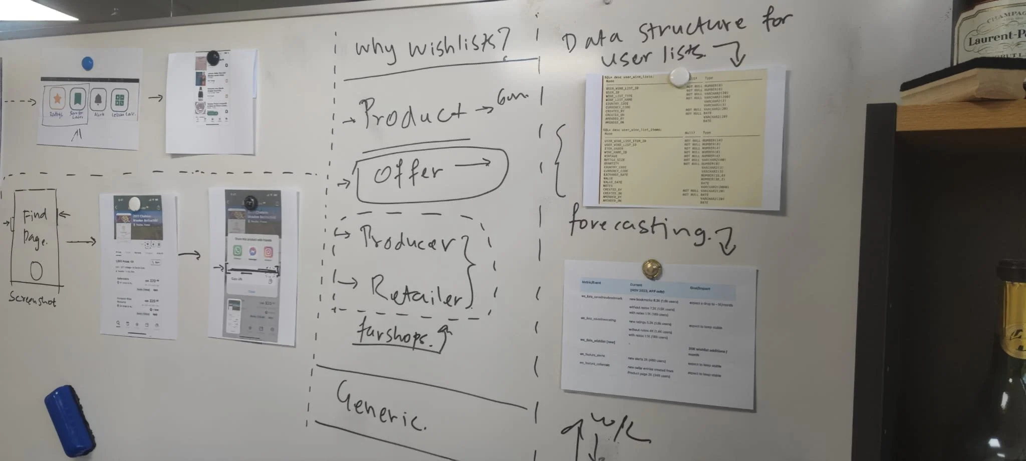

A series of workshops followed the journey mapping session to cover various aspects of datasets, Shopify integrations, customer communication and payment gateways.
These weren’t easy conversations. From and end-to-end user experience, I worked very closely with the delivery manager to ensure we had agreements on the trade-offs for an optimal fulfilment process and the user comms it took to ensure that.
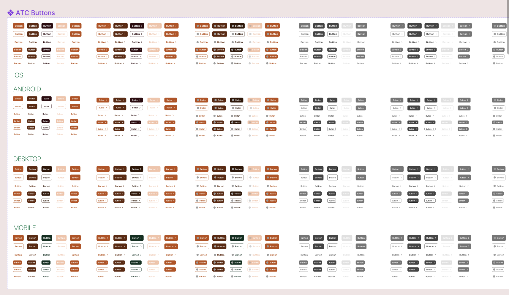
In addition, I designed the new component states, ran several moderated and unmoderated tests.
We also ran multivariate tests on the live website to learn the use of components, colours and the new design tokens we would need to create in Figma to bring the pieces of the puzzle together.

The Bigger Challenge 👇
After 22 years in business, affiliate links was in Wine-Searcher’s DNA. The monies from user clicking the <Go to Shop> links from made a major portion of their revenue.
Dwelling in to e-comm/marketplace was a new to Wine-Searcher — the product wasn’t built to allow for a full marketplace experience.
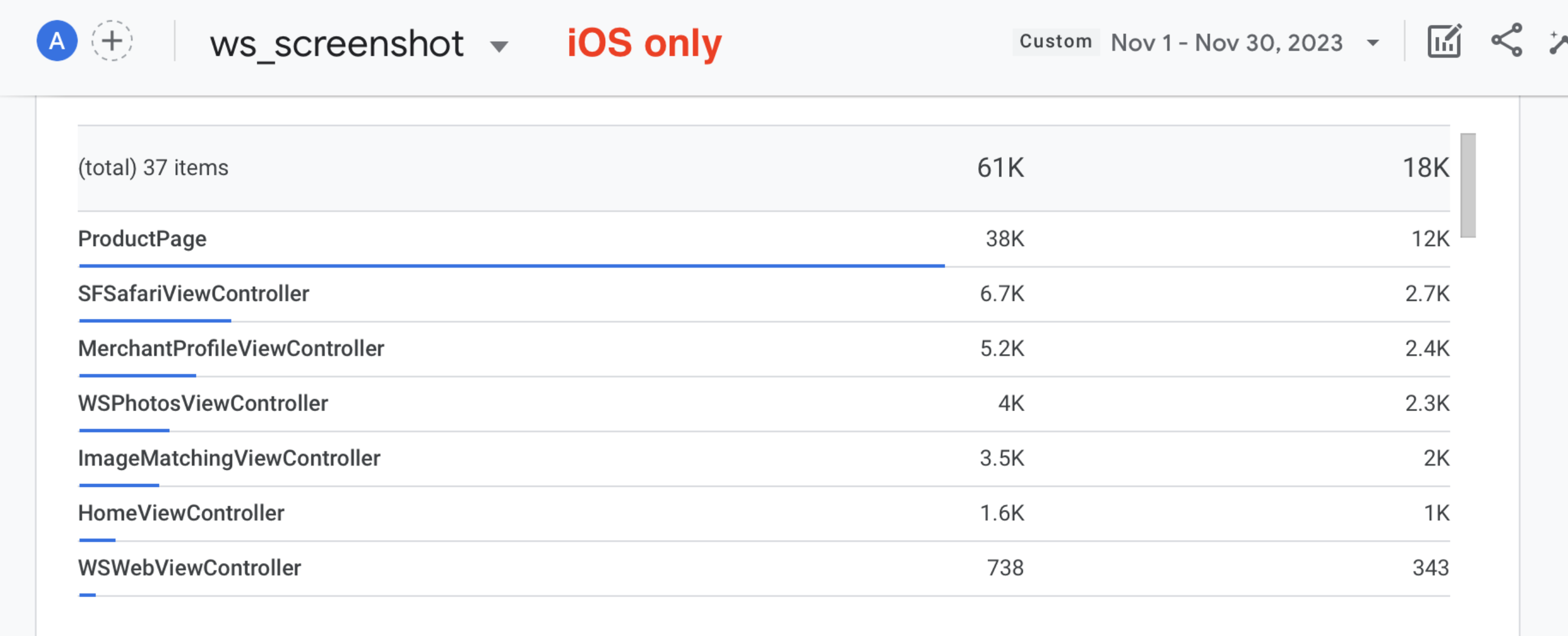
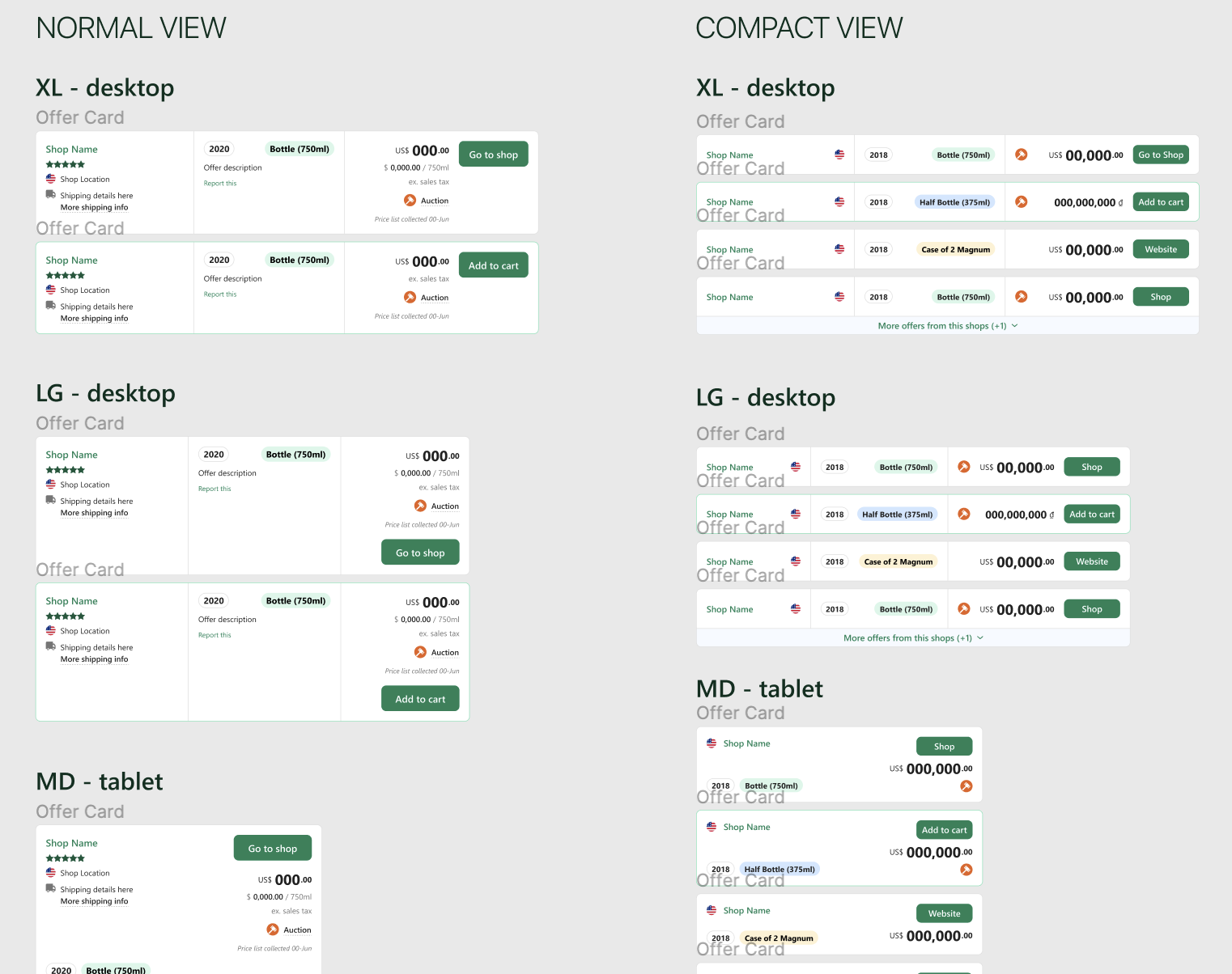
Sizeable amount of Wine-Searcher’s traffic was brought to a landing page (internally referred as Find page) that displayed offers from various stores.
From a design perspective, the task of adding one product to cart was relatively simple. We mapped, created new components and tested this flow to our satisfaction.
However, stretching the experience beyond the first item added to cart was proving to be challenge. We did not know enough about the user to be able to promote the next best product for them to continue the shopping journey — but we wanted feature parity with the competition.

How did we solve it?
— By thinking on a component level and Jobs-to-be-done
Timelines were tight and deadlines were non-negotiable.
I drafted a few stake-in-the-ground jobe to be done (JTBD) to test and confirm what the business wanted out of this experience.
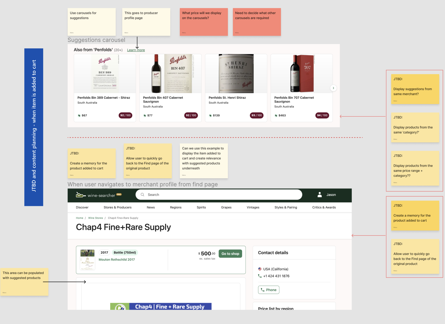
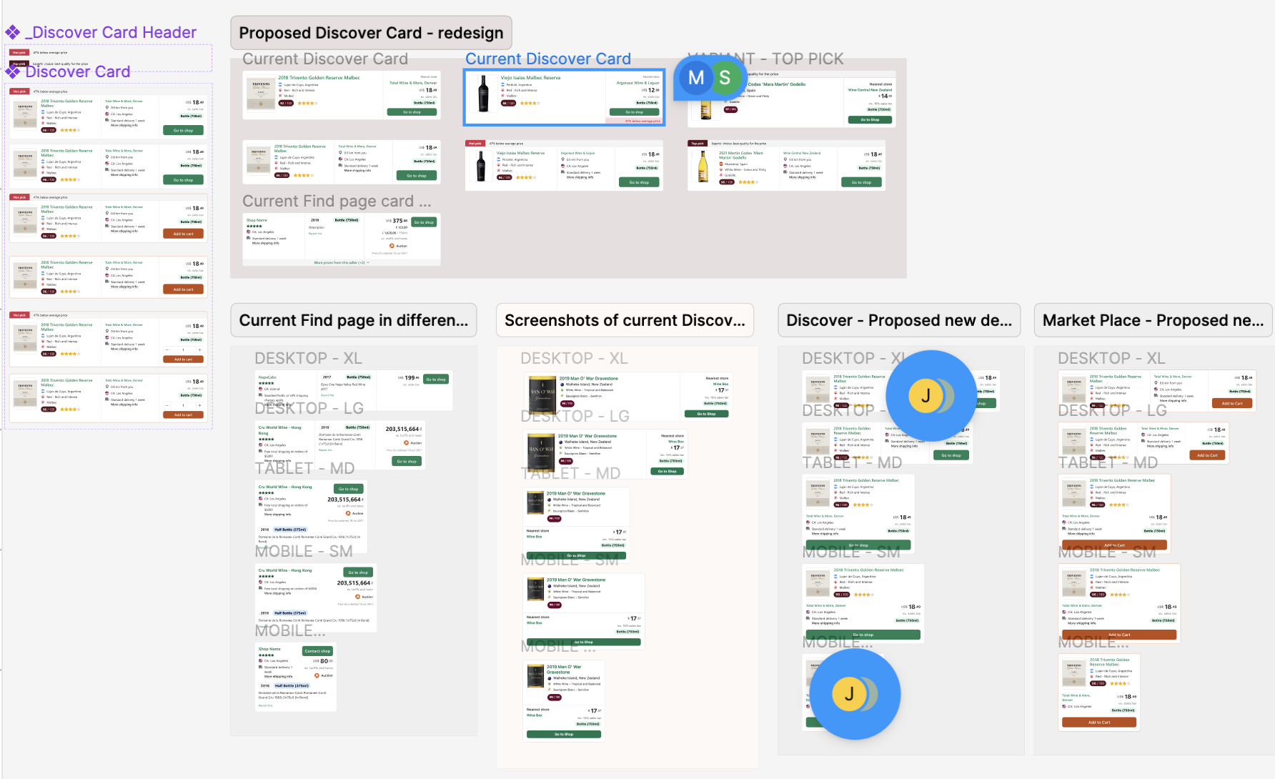
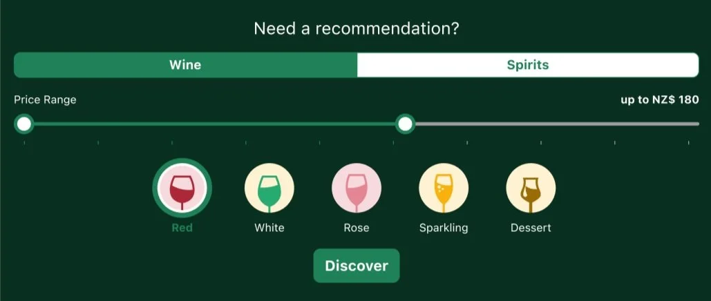
Upon reaching an agreement with stakeholders in a workshop, I took upon myself to work through the analysis of a part of Discover, a widget that allowed the user to get a recommendation for the best spirit or wine with a filter for a price range.
I reviewed some older, neglected but functional components that will suit the jobs we wanted this page to do.
By focussing on the jobs and the components that will help do these jobs in parallel, we were able to rapidly define requirements.
By reskinning these components with fresh UI we were able to redesign the ‘Beverage Discovery’ as a part of the ‘continue shopping’ journey.
We repurposed the logic of the current filters to allow the user to narrow the search using parameters of Styles & Food Pairing, Grape, Country/Region of origin and year of vintage.
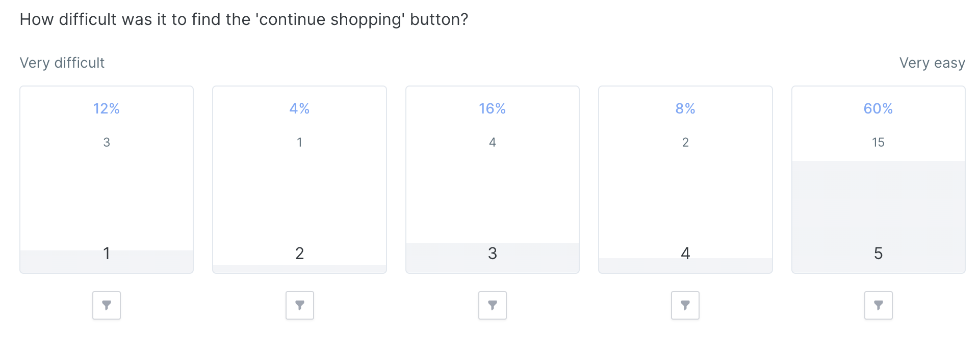
We then ran quick, unmoderated, task based test with a brief rating scale and questionnaire to learn from the users’ ‘continue shopping’ journey.


Perfection is the enemy of done
The tradeoffs 🫡
We acknowledged that this exercise will create some tech debt as the architecture of some of these components was legacy — but it met the needs of the users and the business.
At the end of this exercise, we had successfully designed and delivered means for the user to add more than one item to cart.
Test and iterate
Both, moderated (using Askable and Userlytics) and unmoderated tests (using Lyssna ) help us learn user perception of the UI and test the affordances of the signifiers we designed.
In some cases, the test results were consistent with our hypotheses and in others they were contrary to what we thought we were striving to achieve.

The user tests and data from the pilot led to several fast followers, including some UX debt, that met the user needs more closely.
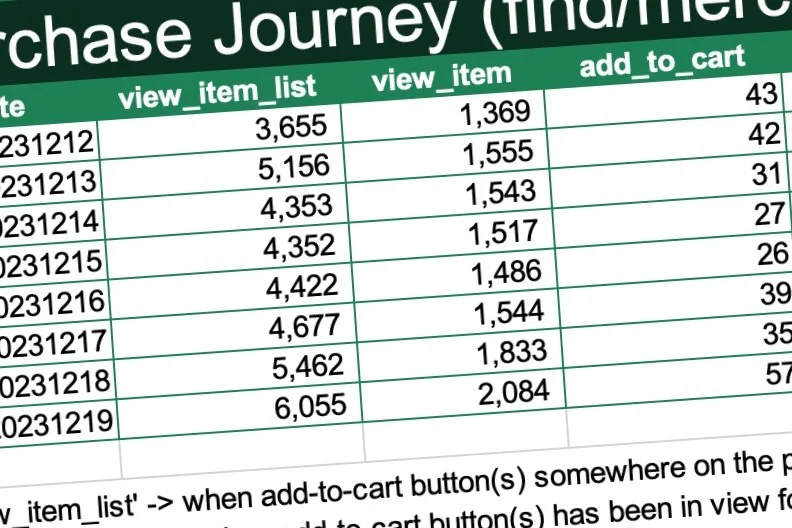
This was slowly reflected in the sales funnel as the conversation levels went up between releases.


The end-to-end experience
I engaged a US based senior product person and a wine connoisseur in a mystery shopping exercise.
Given the holiday period in December, this was the perfect time to evaluate the new Wine-Searcher marketplace experience and benchmark against a competitor experience in the US.
This was specially important because Wine-Searcher’s direct shopping experience was reliant on the third party retailers who shipped goods from their own stores.
We realised that, ultimately to go beyond the MVP experience we needed a higher density of retailers + max fulfilment transparency to user + our own physical fulfilment infrastructure to cover any gaps in post-purchase UX.
This way we build trust with the end user and create means for cross-selling in the post purchase UX.


What gets measured gets managed
What you measure, that you can improve
I worked with the business to understand the metrics they would be tracking periodically. This helped me build an understanding of feature performance and make a case for any required iteration.
This is when the design inputs go beyond usability expectations. I worked closely with the stakeholders to build hypothesis that was tested between specific periods.


The project team appreciated the continuous optimisation of the MVP. This helped me demonstrate the true value a good design practice can bring to a business — by thinking big and small at the same time.


My learnings
This project allowed me to touch several aspects of an end-to-end design experience. It gave me ownership of the practice and run a lean, outcome-based process for faster releases.
Although the process was run rapidly to meet the Thanksgiving and Christmas deadlines for Wine-Searcher’s US users, we did not cut corners or made no effort to challenge or assumptions we made at the beginning of the pilot.
Such projects reiterate the fact the design you see on the screen is only the tip of the iceberg. It is up to the practitioner and the design leadership to expand the depth of the practice to surface the previously ignored.
Getting the relatively design immature teams to wake up to the results a good user centered design process can build was satisfying. The teams became naturally curious, more engaged and had more faith in the solutions they built.
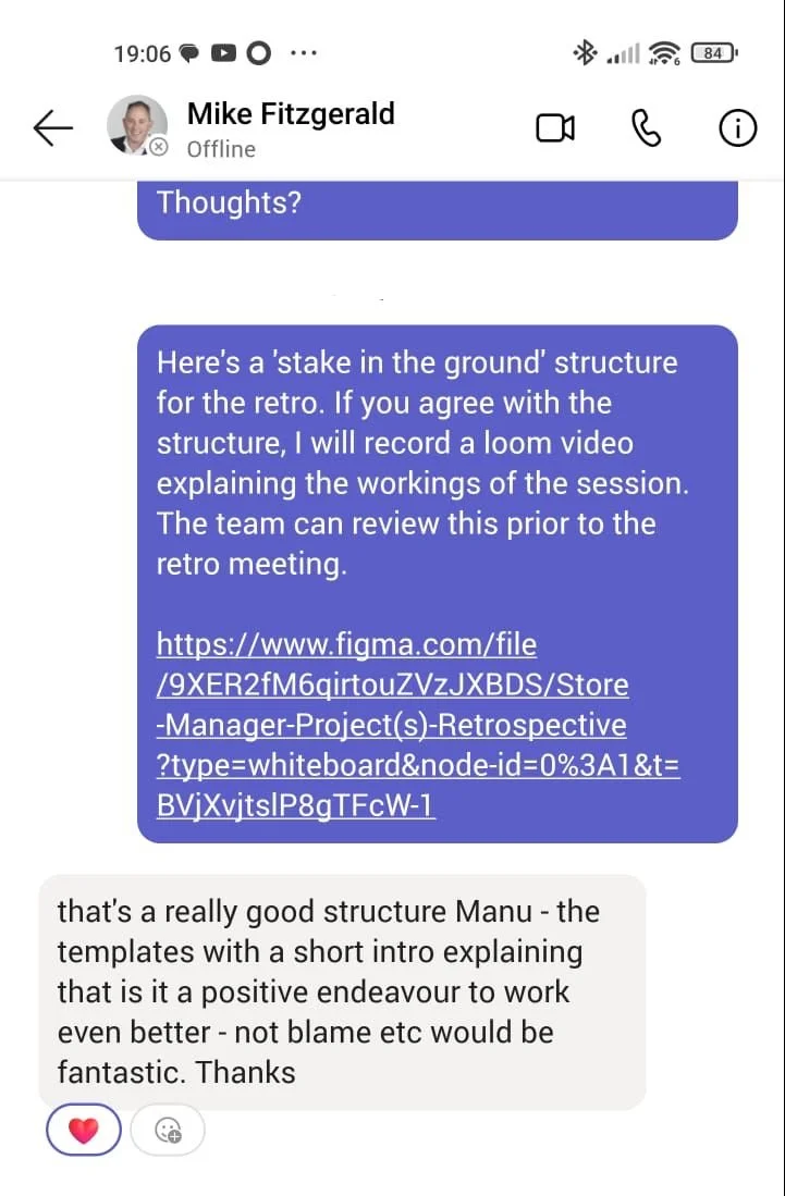
I took upon myself to plan a retrospective to get a feedback this design led implementation of this project.
This helps me get feedback to reflect and improve my practice constantly.